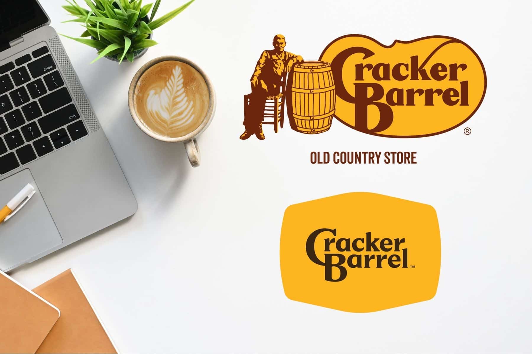
A few days ago, Cracker Barrel unvieled its newly redesigned logo… and fans are not loving it. Which is a bit ironic, considering one of the brand’s core values is “people pleasing”.
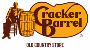
Cracker Barrel has been a staple of Southern hospitality since its founding in 1969. Designed by Nashville designer Bill Holley, the original logo featured Uncle Hershell sitting beside a wooden barrel – a visual soaked in nostalgia, warmth and community. But as the brand hits its midlife moment, it’s only natural to want to evolve and appeal to younger generations.
And hey, we get it! Rebranding is often a strategic move to signal, “We’re still relevant.” But in this case, the redesign may have stripped away too much of what made Cracker Barrel feel like Cracker Barrel.
Why Brands Update Logos (And Why it Matters)
Cracker Barrel’s core audience is aging. Many of its loyal customers are in their 70s and 80s and beyond. So the decision to modernize – lightening up their interiors, updating their menus and yes refreshing their logo – makes sense. A smart rebrand can breathe new life into a legacy company, helping it stay relevant and competitive among younger audiences.

Other big name brands have done this well:
• Nike dropped the text and leaned into the now iconic standalone swoosh in 1995
• Dunkin‘ ditched the Donuts in 2019 to reflect a broader beverage focus
• GoDaddy let go of its silly, squilly haired mascot in 2018 after surviving 22 years for rebrands
Done right, a logo redesign is more than a facelift. It’s a visual handshake that says… “Here’s who we are now but we aren’t that different from who we were.”
But the key word here is right.
When Rebrands Go Wrong
Take IHOP’s infamous 2018 stunt. They briefly changed their name to “IHOb” (flipping the P to a b) to promote their burger menu and appeal to the dinner crowd. The internet erupted and memes came flooding in. But it worked out in the end. Sales spiked, social media impressions boomed and the brand ultimately played it off as a cheeky PR move. Why? Because they were listening to their fans. They knew their core audience and didn’t abandon them in pursuit of a trend.
That’s the thing about rebranding: it needs to connect. It needs to match what the audience knows and loves about you while showing there is something new to still discover here.
Which brings us back to Cracker Barrel.
The Problem with Cracker Barrel’s New Logo
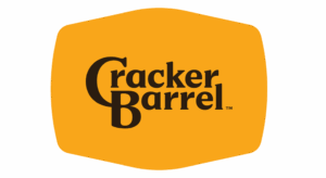
The new logo keeps the brand’s signature golden hues. It keeps the name. But it removes the iconic Uncle Hershell character entirely and in doing so, much of what made the brand feel personal.
On paper, the redesign checks the boxes: simplified design, better for digital, easy to scale across platforms.
But in execution….
it loses the magic.

Gone is the warmth.
Gone is the feeling of slowing down.
Gone is the invitation to stay awhile, play a game and eat something made with love.
What’s left? A logo that feels more like a fast-casual chain than a front porch gathering place.
Simplicity ≠ Soulless
Cracker Barrel’s mission has always been simple:
We figure if we take care of our guests, well, then the business will take care of itself.
But taking care of people is about more than what’s on the plate. It’s how you make them feel. And while logo design is just one piece of a brand’s identity, it’s often the first impression. If the logo no longer reflects the values behind it – hospitality, comfort, community – then it’s more than just a style update. It’s a messaging misfire.
A modern logo doesn’t have to be minimal. And a simple logo doesn’t have to be stripped of personality.
Why This Redesign Doesn’t Work
Let’s be real: it’s not just the old guy on the barrel. It’s what he stood for.
He represented the slow place of shared meals. The joy of gathering with loved ones. The sense that life doesn’t have to be rushed or automated or cold. In removing him, the logo sheds a layer of history and humanity and what’s left doesn’t feel quite as welcoming.
Yes, logos need to evolve. But the best logo redesigns stay rooted in a brand’s truth.
How Cracker Barrel Could’ve Done Better
Cracker Barrel didn’t need to abandon it’s identity to modernize – it needed to refine it.
A more effective rebrand would’ve:
• Preserved key elements that anchor the brand in tradition
• Modernized the illustrations without removing it entirely
• Connected visuals to mission reinforcing values like hospitality, warmth and community
• Prioritized emotional resonance, not just digital scalability
This isn’t about nostalgia. It’s about preserving brand recognition and trust, especially when your audience has been showing up for you for decades.

